

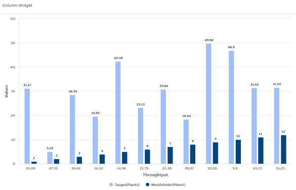
Column Chart
To create a Column Chart that displays each category as a rectangular column, where the height represents the value, and supports multi-series data visualization.
Industrial use case and scenario
Comparing daily or shift-based production output is essential in manufacturing to uncover performance trends and identify productivity gaps. Visualizing this data using a column chart allows for quick, intuitive comparisons between shifts or time periods. For example, a factory may track the number of units produced per shift to detect inconsistencies across teams. The clear, side-by-side format of a column chart makes it easy to spot variations, enabling managers to make informed decisions about resource allocation, shift planning, and performance optimization.
Column Chart
Configuration Options
To learn about common configuration options, refer to the following topics from the Edit Widgets section:
|
Label |
Description |
|
DataSource |
See DataSource |
|
Events |
See Events |
|
Link |
See Link |
|
Expressions |
See Expressions |
|
Alias |
See Alias |
|
Help |
See Help |
|
Refresh |
See Refresh |
Styles
On the Styles tab, add the following details to create the Column Chart:
|
Fields |
Description |
|
Title |
Title or Label of the widget to be displayed in the dashboard. You can either enter the title manually or click the + icon to open the Parameter Value Configuration pop-up and select the name. For more information, see Variable Usage. |
|
Subtitle |
Enter a short description of the KPI represented in the widget. It will be displayed below the chart title. You can either enter the subtitle manually or click the + icon to open the Parameter Value Configuration pop-up and select the name. For more information, see Variable Usage. |
| Generate Multiple Value Axis |
Select the checkbox to create multiple Value Axes in the chart. |
| Series by |
Choose from the list of columns to group the data accordingly and display them in series. |
|
Category Axis Column(X-Axis) |
Choose from the dropdown to assign data to Category Axis (X-Axis). |
|
widget.hideCategoryColKey |
Select the checkbox to hide the widget's X-axis. |
|
Value Axis Columns(Y-Axis) |
Choose from the dropdown to assign data to the Value axis (Y-axis). |
|
Column Ranges |
Select this checkbox to display a range for each category, where the chart column visually represents the minimum and maximum values. |
|
Range Value Column |
Choose from the dropdown to provide the corresponding min and max values for each category. |
|
widget.hideValueColKey |
Select the checkbox to hide the widget's Y-axis. |
|
Stacking |
Select a stacking method from the Stacking dropdown to define how chart values stack in column or bar visualizations. Each option changes how data is visually grouped and interpreted:
|
|
Inverted |
Select the checkbox to invert the chart so that the Category Axis Column becomes the Y-Axis and the Value Axis Columns become the X-Axis. |
|
Legend |
Select the checkbox to display the legend in the widget. When enabled, the following options are available:
|
|
Data Label |
Enable the Data Label checkbox to display numerical values directly above each data point on the chart. Once enabled, additional customization options appear:
|
|
Zoom |
The Zoom dropdown allows you to control zooming behavior on the plot. You can select from the following options:
|
|
Value Axis Minimum |
The value axis is the Y-axis. This field allows you to specify the minimum range for the Y-axis. You can enter the value manually or click the + icon to select a value using the Parameter Value Configuration. For more information, see Variable Usage. |
|
Value Axis Maximum |
The value axis is the Y-axis. This field allows you to specify the maximum range for the Y-axis. You can enter the value manually or click the + icon to select a value using the Parameter Value Configuration. For more information, see Variable Usage. |
|
Value Axis Soft Range |
The system applies hard range by default for the value axis (Y-axis). If a plot value is greater than the hard range, then the chart automatically truncates that value. If you enable the Value Axis Soft Range checkbox, then the range adjusts itself based on data. |
|
Unit Of Measurement For Value Axis |
Specifies the unit of measurement displayed in the Value Axis Title of the chart. You can either enter the value manually or click the + icon to select a value using the Parameter Value Configuration. For more information, see Variable Usage. |
|
Value Column Title |
Displays the value axis (Y-axis) title. You can either manually enter the name for Value Column Title or click the + icon to generate the Parameter Value Configuration pop-up and select the name. For more information, see Variable Usage. |
|
Tooltip |
To configure tooltips in the plot, click the +Tooltip option. This lets you define multiple custom tooltips that appear when hovering over data points. Once you click +Tooltip, additional configuration fields appear:
The columns shown in the tooltip or data table are dynamic and vary based on the dataset retrieved from KSH. |
|
Tooltip Display Mode |
Use the Tooltip Display Mode dropdown to control how tooltips appear on the plot. Choose from the following modes:
|
|
Custom ID |
The value in this field gets automatically filled out by the dashboard. This field helps to identify the widgets while configuring events. This can be user-defined as well. |
|
Export CSV |
Enable this checkbox to download the information available in the Column chart in csv format. |
|
Export JPEG |
Enable this checkbox to export in JPEG format. |
|
Export PNG |
Enable this checkbox to export in PNG format. |
|
Borderless Header |
Enable this checkbox to hide the border of the title. |
|
Frameless |
Enable this checkbox to hide the frame around the widget. |
|
Fullscreen |
Enable this checkbox to view the widget in full-screen mode. |
Series
On the Series tab, add the following details to create the Column Chart:
|
Fields |
Description |
|---|---|
|
Color |
Allows you to select color for the series. Click the dropdown menu and select the required color. |
|
Opacity |
Indicates widget's transparency level to be used on a background image. Default is 1, indicating No Transparency. Set to 0 for full transparency. Range is from 0 to 1. |